CapCut Color Grading Tutorial Step by Step Guide
Color grading is one of the most powerful techniques in video editing. It transforms normal footage into professional, cinematic visuals that capture attention instantly. Whether you create YouTube videos, TikTok clips, Instagram Reels, short films, or promotional content, mastering color grading inside CapCut can dramatically improve your content quality without requiring expensive software or professional cameras.
In this detailed guide, you will learn:
- What color grading really means
- The difference between correction and grading
- Step by step color grading workflow
- Cinematic formulas you can apply instantly
- Mistakes to avoid
- Professional level tips used by experienced editors
This tutorial is written in a practical, beginner friendly, and expert structured format so that anyone can follow along.
What Is Color Grading in CapCut
Color grading is the creative process of enhancing and stylizing the colors of your video to create a specific mood, atmosphere, and emotional impact.
When you shoot a video, your camera captures raw footage. Even high quality cameras do not always produce perfect colors straight out of the device. Lighting conditions, white balance issues, shadows, and highlights can make footage look flat or dull.
Color grading helps you:
- Improve visual clarity
- Balance lighting
- Enhance skin tones
- Create cinematic tones
- Match multiple clips consistently
In CapCut, color grading tools are available through:
- Adjust panel
- Filters
- LUT support in PC version
- Overlay techniques
The platform gives creators powerful yet easy to understand tools similar in concept to professional software like Adobe Premiere Pro and DaVinci Resolve.
Color Correction vs Color Grading
Many beginners apply filters immediately without correcting the footage first. That is a common mistake.
Here is the proper workflow:
Color Correction
This step fixes technical problems:
- Exposure issues
- White balance problems
- Overexposed highlights
- Crushed shadows
- Uneven tones
Think of this as cleaning your footage.
Color Grading
This step adds style:
- Warm cinematic tones
- Cool dramatic looks
- Vintage film appearance
- High contrast modern style
Always correct first, grade second.
Why Color Grading Matters for Content Creators
If you are building authority in video editing or running a CapCut related website, understanding color grading strengthens your expertise.
Professionally graded videos:
- Look more premium
- Increase watch time
- Improve audience retention
- Build brand consistency
- Stand out in competitive feeds
Social platforms compress videos heavily. Proper grading ensures your video still looks sharp and attractive after upload.
Preparing Your Footage Before Grading
Before opening the Adjust panel, make sure:
- The video resolution is high quality.
- The footage is stable and not shaky.
- Lighting conditions are acceptable.
- Noise levels are minimal.
If your footage is too dark or extremely overexposed, grading will not fix everything. Good shooting practices make grading easier and more effective.
Pro Tip: Shoot in natural light whenever possible. It gives smoother tones and better dynamic range.
Step by Step CapCut Color Grading Tutorial
Now let us go through the complete grading workflow.
Step 1: Import Your Video Project
- Open CapCut.
- Tap New Project.
- Select your clips.
- Add them to the timeline.
Make sure you select the primary clip before applying adjustments. If you have multiple clips from the same scene, grade one clip first and then copy adjustments to maintain consistency.
Step 2: Open the Adjust Panel
Tap on the selected clip and choose Adjust from the bottom menu.
You will see controls such as:
- Brightness
- Contrast
- Saturation
- Exposure
- Highlights
- Shadows
- Temperature
- Tint
- Fade
- Sharpen
- Vignette
Each tool plays a specific role in shaping your final look.
Step 3: Fix Exposure and Balance Lighting
Always start with exposure correction.
Brightness – Adjust brightness slightly to ensure the subject is clearly visible. Avoid increasing too much because it reduces contrast.
Exposure – Exposure changes overall light levels. Small changes between +5 to +15 are usually enough.
Highlights – Reduce highlights if bright areas like sky or lights look blown out.
Shadows – Increase shadows to recover details in dark areas without making the video look washed out. The goal is to create balanced lighting where no part of the frame looks overly harsh.
Step 4: Improve Contrast for Depth
Contrast makes your video look more dynamic.
- Low contrast makes footage flat.
- High contrast creates depth and dimension.
Increase contrast moderately between +10 to +25. Too much contrast may destroy details in shadows. Contrast is one of the most important cinematic tools.
Step 5: Adjust White Balance
White balance affects the mood of your video.
Temperature:
- Increase for warm golden tones.
- Decrease for cool blue cinematic look.
Warm tones work great for vlogs and lifestyle videos.
Cool tones work well for dramatic or travel content.
Tint:
Adjust slightly toward magenta to improve skin tones. Avoid excessive green tones. Proper white balance makes skin look natural and professional.
Step 6: Fine Tune Saturation
Saturation controls how strong or soft the colors appear in your video. It affects the overall mood and visual impact of your footage.
- Increase slightly for vibrant travel or outdoor content.
- Reduce slightly for a cinematic, dramatic look with softer tones.
Avoid over saturation, as it can make skin tones look unnatural and colors appear harsh. Small, subtle adjustments always deliver more professional results.
Step 7: Add Fade and Film Style
- Fade reduces strong contrast and lifts dark areas slightly, giving your video a soft vintage film appearance. It helps create a smooth, cinematic mood that feels less digital and more artistic.
- Keep fade between 5 to 15 for a natural and subtle effect. Small adjustments are usually enough to add character without losing detail.
- Too much fade can remove depth and make the video look dull, flat, or washed out. Always balance it with proper contrast.
- This technique is especially popular in social media cinematic reels where creators want a stylish and modern film inspired look.
Step 8: Sharpen Carefully
- Sharpen enhances edge clarity.
- Set sharpen between 10 to 20 for clean details.
- Too much sharpening creates noise and unnatural outlines.
- Always zoom in while adjusting sharpen to monitor details properly.
Step 9: Apply Filters with Reduced Intensity
CapCut provides built in filters categorized by themes.
Instead of applying full strength filters:
- Reduce intensity to 40 to 60 percent.
- Use filters as enhancement, not replacement for grading.
Professional editors rarely use 100 percent filter strength.
Step 10: Use LUTs for Advanced Cinematic Looks
On the PC version of CapCut, LUT support allows you to import cinematic profiles.
LUTs simulate professional color science used in advanced software.
Steps:
- Select your clip.
- Go to Adjust.
- Choose LUT option.
- Import LUT file.
- Reduce intensity if needed.
LUTs are useful for:
- Travel films
- Commercial style ads
- Music videos
- Short cinematic edits
Cinematic Preset Example
Here is a beginner friendly cinematic formula:
- Brightness +5
- Contrast +20
- Highlights -30
- Shadows +25
- Saturation -5
- Temperature -5
- Tint +3
- Fade +10
- Sharpen +15
Always adjust based on lighting conditions.
Color Grading Styles for Different Content
YouTube Talking Head
- Warm temperature
- Balanced exposure
- Natural skin tones
- Light sharpening
Travel Videos
- Vibrant colors
- Slight cool shadows
- Balanced highlights
Instagram Reels
- High contrast
- Slightly boosted saturation
- Clean sharp visuals
Dark Cinematic Mood
- Lower exposure
- Cool temperature
- Reduced saturation
- Deeper shadows
Each style serves a different storytelling purpose.
Common Mistakes to Avoid
- Applying heavy filters immediately
- Over saturating footage
- Ignoring skin tones
- Not matching clips
- Exporting in low quality
Color grading is about subtle enhancement, not extreme transformation.
Mobile vs PC Grading in CapCut
Mobile Version:
- Easy and fast adjustments
- Great for social media creators
- Basic but powerful tools
PC Version:
- LUT support
- Better color preview
- More control over fine adjustments
Serious editors prefer PC version for advanced workflows.
Professional Color Grading Tips
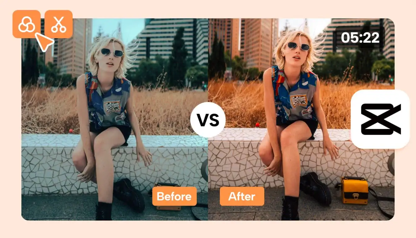
- Always compare before and after.
- Grade in a bright environment.
- Keep skin tones realistic.
- Copy adjustments for consistent look.
- Export in highest possible resolution.
Practice is key. The more footage you grade, the better your eye becomes at identifying color balance and cinematic tone.
Final Thoughts
Color grading in CapCut is simple yet powerful. You do not need expensive software to create stunning visuals. With proper exposure correction, balanced contrast, correct white balance, and subtle stylistic adjustments, you can turn ordinary footage into cinematic content.
If you are building authority around CapCut tutorials, mastering color grading is essential. It demonstrates practical expertise, builds user trust, and helps your audience achieve professional level results.
Start practicing with different footage types, test multiple styles, and develop your own unique color signature. Consistency and subtlety are the keys to professional looking videos.